Colour Courage
Colour Courage by Davina Preca
Colour is one of the most exciting elements in interior design, it has the potential to instantly communicate an atmosphere and make a strong impact. Colour sustains the unmistakable quality of emotion. It has the power to evoke distinct emotional sensations varying from playful, subdued, dramatic, poetic, vibrant or dominating. As well as being mood altering it also has the great ability to add dimension to spatial perception.
Colour theory discloses the knowledge of how to use colour to your advantage. The use of colour schemes, special colour effects, colour relationships, the effect of light on colour, the effect of colour on space all contribute to your desired end result. An amount of colour planning can turn what may seem daunting into something that can be easily followed.
Inspiration
A useful starting point for a colour scheme is to create a concept. This can derive from various stimuli a post card, an item of clothing, a photograph, a piece of fabric or a combination of items. Limit your choice to three items so the brief is clear and does not risk becoming frail.
Colour Wheel
Confidence, knowledge and experience are all valuable pointers in how much colour courage to employ when designing your interior. Colour schemes vary from the most simple to the more complex.
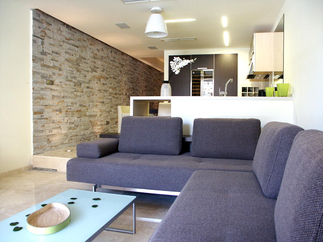
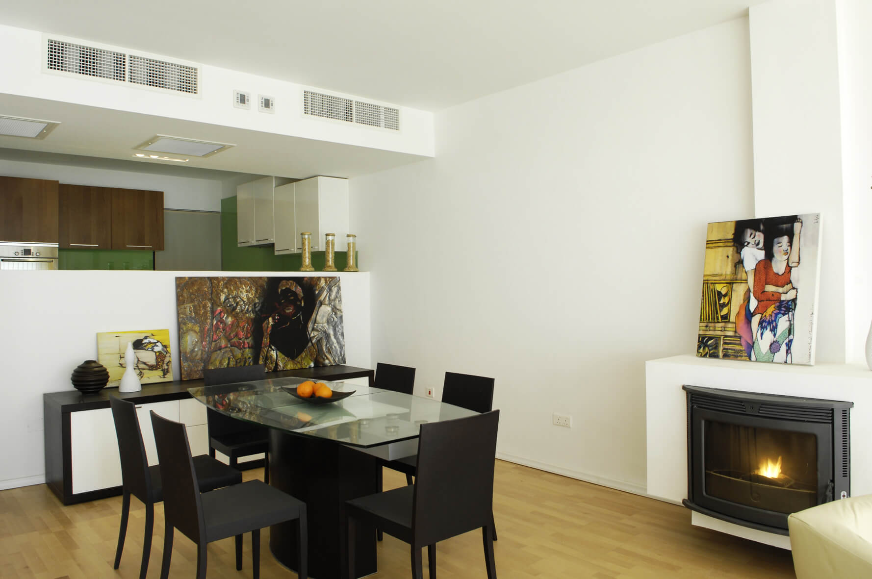
Monotone relies on the use of one or a limited range of values such as tints of grey, hues of white and tans. Within this restricted neutral palette it is hard to go wrong but it does run the risk of being, as the word suggests monotonous. To turn this into a successful scheme, add large pieces of artwork or pattern and texture. This scheme is a useful rule to follow when the space needs to be unified and is lacking a sense of peace. A variation of the scheme can include a broader range of hues from rye to ochre from biscuit to mink and chocolate to slate.
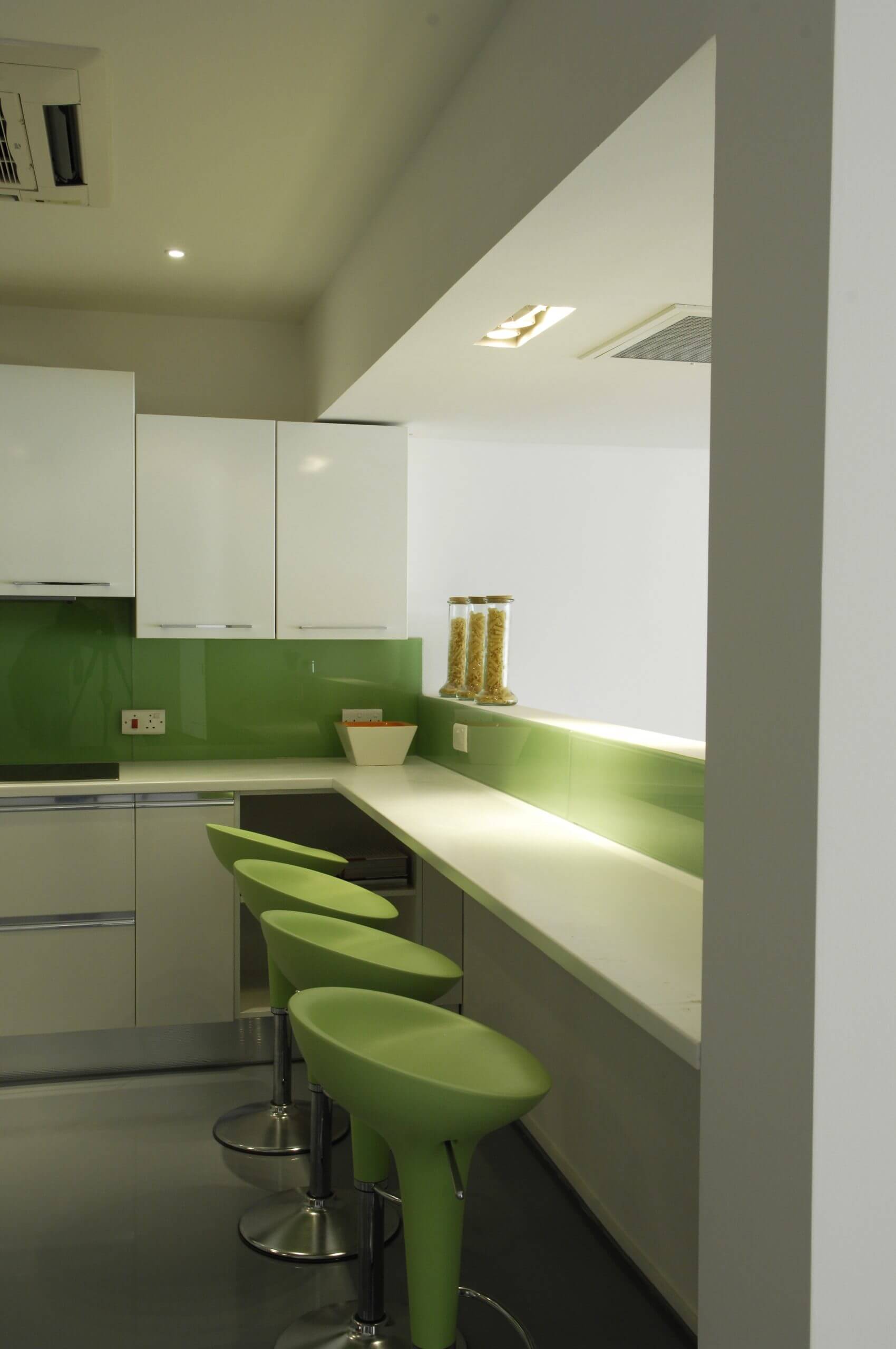
Monochrome is what we know as the “red room” or “blue room” it uses a single hue in a variety of shades or tones. This can be a rather bold statement and lends itself better to pass through spaces such as corridors or entrance halls.
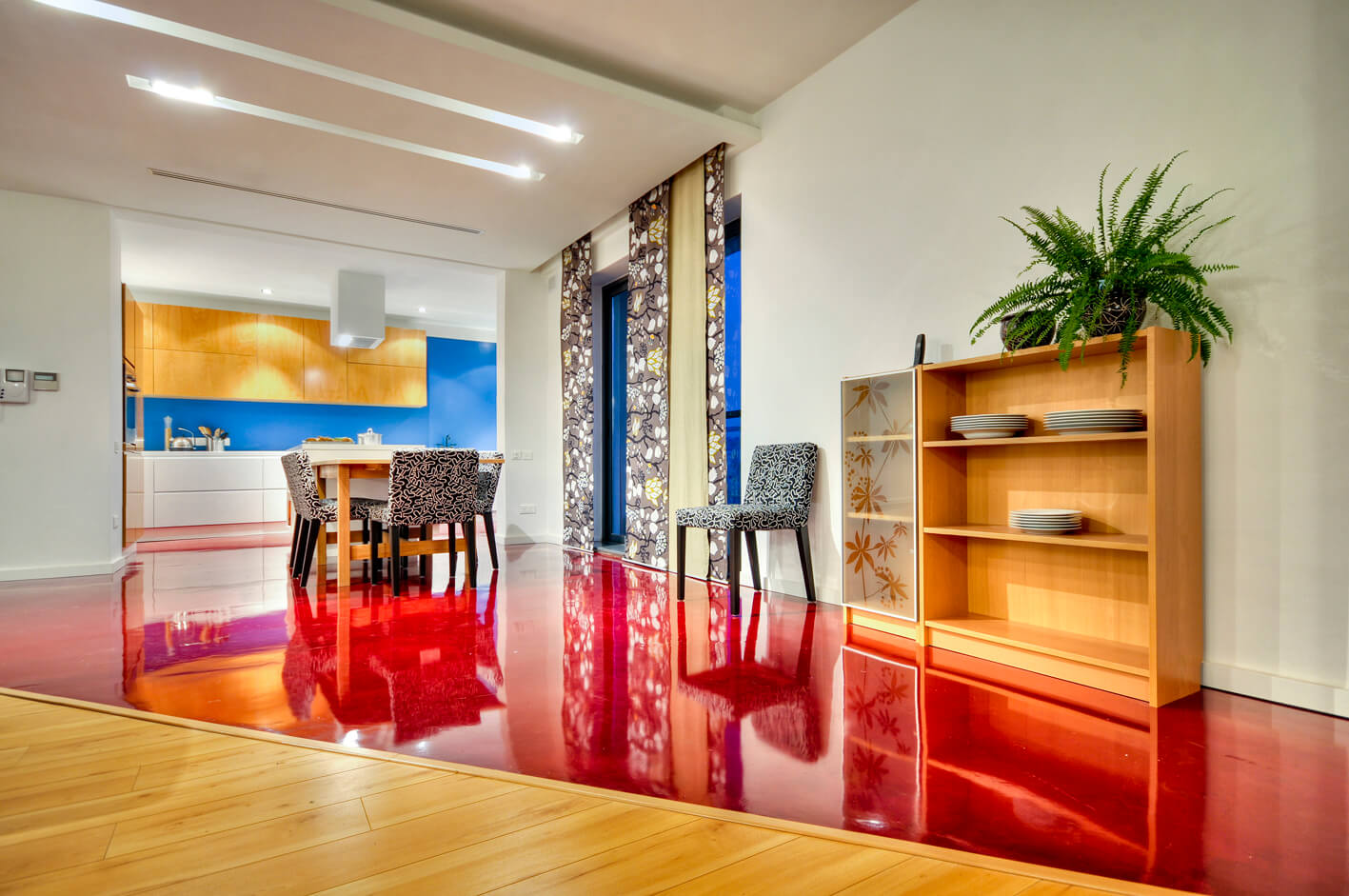
Analogous employs more skill and involves one primary or secondary colour plus the hues adjacent to it, so blue, blue green and blue violet. This scheme is fairly easy to follow and so long as you stick to one third of the colour wheel, the end result will be harmonious. Complementary involves selecting two colours from opposite sides of the colour wheel so, red and green, orange and blue, yellow and violet. If used in their full chroma they can look too bold and perhaps tiring, break this up by using a variety of saturated tones and hues.
Triad selects three hues roughly equidistant from one another on the colour wheel, red, blue and yellow: orange, green and violet create a triad. These schemes are the hardest to employ and work best when two or more of the hues are used subtly. This way the overall effect is not overpowering.
Making Good
The beauty about colour is that it is one of the easiest and inexpensive ways to improve a space. If the scheme of an interior was not pre planned one can end up with mismatched items, clashing coloured walls and all sorts of items which have accumulated over the years the result being a fragmented space. This can be rectified through selecting the items you want to retain and working towards creating a unified scheme.
Space to Space
When planning the range of colours to be used keep in mind the visual connection between spaces. A repeated mistake is to use too broad a range making each space feel disjointed rather than flowing. This can be done by maintaining and repeating a common element throughout.
Colour and Light
We see colour through light. Whether the space is lit by natural or artificial lighting this will have an effect on the overall appearance. Generally residential spaces are lit with warm lighting that mimics daylight so the difference is not great. To test your selected scheme view the colours both in daylight, indoors and by night excluding natural light. Colour will generally appear darker in a dimly lit space and brighter when more light is present.
Effect Of Colour on Space
The effect colour has on space is a useful tool that can be used to manipulate the way we perceive a space. Warm colours are said to appear closer than they actually are and cool colours are said to appear further away. With lighter colours we perceive space larger and lighter whilst with darker colours we perceive space smaller and heavier. If the end wall of a long narrow space is painted a warm colour whilst the sides are painted a cooler tone, the space will appear squarer. Colour can also be used to emphasize, painting framework round doors or windows in a contrasting colour will define the form and has the ability to break up the space. The reverse is to deemphasize, by painting doors and windows the same colour as walls, they become less prominent, so the space is more continuous and feels more spacious.


