The Office – Colour and Light
CONCEPT
The office is the face of the company, no longer a matter of four chairs, storage and a board room. A successful space is one that works well both on a practical level as well as illustrating the company brand. In other words, it is a creative environment for those who occupy the space, as well as a clever marketing tool.
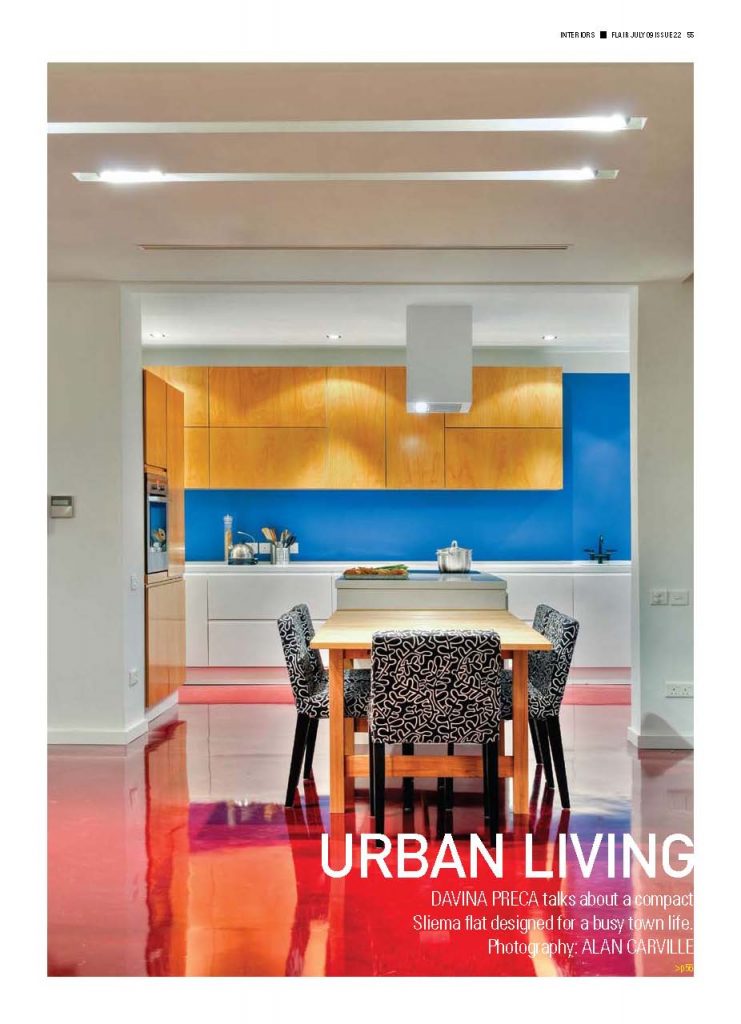
So colour and light are only elements within this broader perspective and should be discussed within the overall branding concept. They should be used as a reflection the company wants to portray. For example an innovative advertising firm might choose bright, vibrant colours to reflect a dynamic, fresh outlook. A financial firm whose branding aim is to portray a sense of loyalty and stability might choose a palette of somber, deep colours.
COLOUR
Colour within office space is a new field of study. Before offices were painted in dull grey as this was not disliked by anyone so it was the safe option at the risk of being monotone and boring. Colour can be highly personal but some studies show that blue within the working environment is said to induce creativity and red is best when used when detail oriented tasks are being carried out, perhaps as it keeps you alert and focused. When used together colour, texture and pattern can provide an overall stimulating environment.
Colour can also be used in the less obvious fashion, on a more practical level it can help an office do away with or lessen the use of words and tiresome filing cabinets by colour coding. A colour and/or shape can be assigned to specific rooms or projects, done correctly this could be a huge time saving benefit. This colour coding can also be applied as a solution to sign posting in larger offices. This enables both the daily user and the visitor a comprehensible guide to circulation and the function of each space.
LIGHT
The properties of light can also be used in line with the company outlook. One must of course take into prime consideration the type of work that is being done, any detailed work like anything handmade or reviewing, advertising or graphics would require specific well lit spaces. Otherwise it is not essential to have a brightly lit 70s office. Too much artificial light can be tiring on the eyes and can heavily contribute to electrical bills. As well as contributing to savings natural light has many benefits such as being a mood enhancer and can also improve immunity. With our very warm climate it is vital to control the amount of light entering the building. A south facing façade will bring in abundant light which can be welcomed in winter but can cause glare and overheating in summer. The placement of windows and apertures which face the outdoors should be carefully considered to make the building work efficiently. This should be done by Ideally sketching out the furniture layout at the planning stage. The use of blinds, tinted glass and heat reducing film are vital and should be factored in when designing a building from scratch.
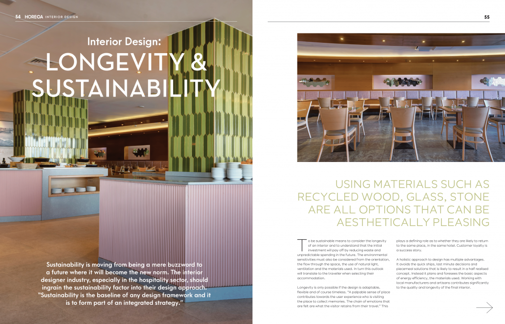
Light can play a vital role in adding a sense of movement, depth and energy to an otherwise dull space. The use of light fittings of different sizes at varying heights is one example of how this might be achieved. This simple concept can be used to create a continuous flow throughout the space.
CONCLUSION
Office design correctly implemented can promote motivation, creativity and spending longer hours at work. A creative space cannot make a person become creative but if you do not change the space people do not change their behavior. It can also prove to be a magnet for creative talent, as creativity seeks a likeminded environment. So office design can be used to inspire and colour and light are two tools most likely to aid in achieving this.
Davina Preca BA(Hons) Interior Architecture & Design
Captions
01: Muted colours of the same shade in varying tones together with a large central light fitting give a small office a sense of space.
02: Lighting is used over the desks to illuminate without cluttering the work surface.


